How to Design Readable Typography for Paper Animation Videos
A paper fold can make a title feel physical. A torn edge can give a product reveal a handmade character. But if the words disappear into creases, change too quickly or compete with a busy background, the viewer may remember the effect and miss the message. The practical task is to make the typography work throughout the movement, including the moments between attractive still frames.
PaperAnimation.ai serves creators making paper folds, newspaper highlights, magazine-letter effects and related clips. Its homepage describes a simple starting point: “Upload your image, select the object”. This guide focuses on preparing the text and assembling the resulting sequence. It applies whether lettering is part of an uploaded image or added later in a video editor; it does not assume that every animation mode accepts custom font files.
Write the message before choosing the paper effect
Start with a single sentence describing what the viewer should understand. For a fictional community workshop, that might be: a weekend session is open for booking. Break that into a short title, one useful detail and an action. This gives the animation a purpose and prevents the opening from becoming a collage of unrelated words.
Separate information that attracts attention from information that helps someone act. “Weekend workshop” can carry the reveal, while the date and booking instruction arrive when the composition settles. Putting the title, venue, price, instructor biography and website into the same moving scrap creates a reading task that the format may not support.
Use the actual wording during development. A mockup approved with “New” is a poor test for “Introduction to Botanical Illustration”. If a title is long, decide which phrase belongs in the animation and which belongs in the surrounding post or a later frame. Preserve essential meaning rather than abbreviating until the words become mysterious.
| Message component | Useful treatment | Common mistake |
|---|---|---|
| Opening title | Short phrase with a clear visual focus | Several equally prominent messages |
| Supporting detail | Stable text after the reveal | Small copy moving with every fold |
| Action | Plain instruction on a settled frame | A URL that vanishes before it can be read |
| Attribution | Readable source near a quoted statement | Decoration that looks like real press coverage |
Plan a readable moment between the entrance and exit
Think in three stages: the text appears, the viewer reads it, and the sequence moves on. The reading stage needs its own space in the edit. A title that is technically present for several seconds may only be fully visible for a fraction of that time if the rest is spent rotating, folding or sliding out of view.
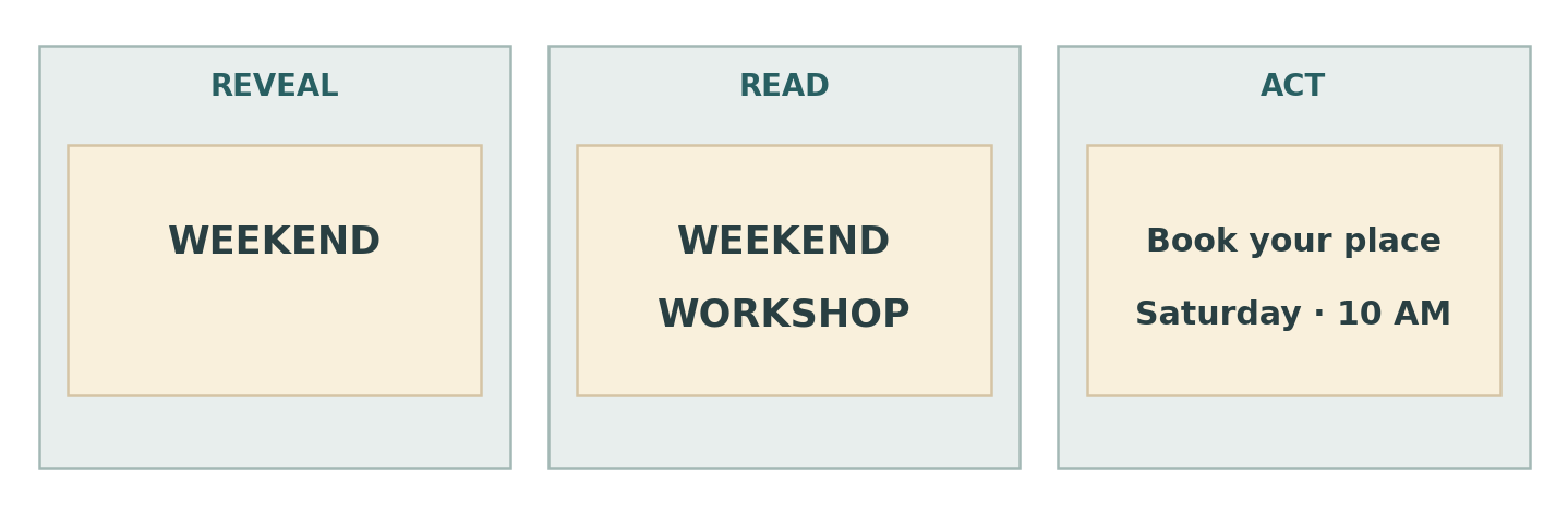
Begin with a generous hold, then watch the sequence at normal speed on a phone. Ask someone unfamiliar with the project to repeat the message. If they miss a key detail, try reducing the wording or extending the settled frame before adding more emphasis. There is no universal duration that makes every phrase readable; familiarity, length and competing movement all matter.
Avoid changing the background, moving the title and introducing a subtitle at the same instant unless the overlap serves a clear purpose. Let one event lead into the next. The viewer should not have to choose between decoding the words and identifying the object being revealed.
Keep a separate layer for essential information
Where your editing workflow allows it, keep the core title or final instruction separate from the animated object. You can animate a product photograph with a paper effect and place a clean title above it in the editor. This is particularly useful when deformation would bend letters or obscure a small label. Check the exported result rather than assuming that separate layers guarantee readability.
Test the font against texture and movement
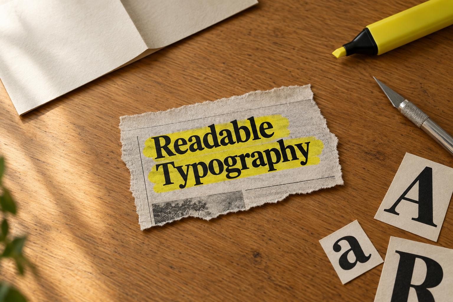
A paper aesthetic does not require every word to look distressed. Start with a readable base and add texture around it. Fine strokes, narrow counters and delicate details deserve close inspection after scaling and export. A typeface that feels elegant in a large still may lose its character when compressed into a small moving clip.
Use the same phrase when comparing fonts. Include the real punctuation, numerals and accented characters. Look at the longest word and at combinations that can become ambiguous when small. Do not choose a family from a single attractive capital letter and assume the rest of the campaign will behave equally well.
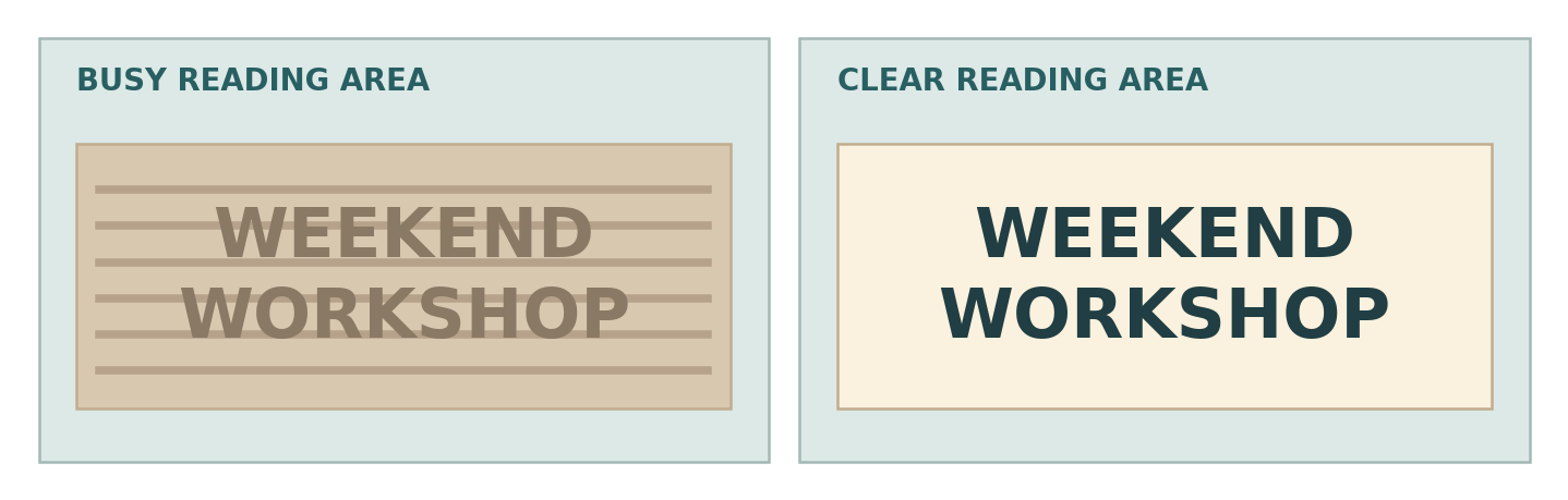
Keep the texture from competing with the letterforms. Place the words on a calmer section of the paper, reduce the texture beneath them, or adjust the tonal relationship. Heavy shadows can also muddy the edges of letters. Check several frames, because a moving fold can turn a clear background into a dark band halfway through the reveal.
Magazine-letter effects can use deliberate variation, but variation still needs limits. Preserve a recognisable reading order and avoid rotating each letter so far that the word becomes a puzzle. A mixed-letter opener may work best when followed by a clean, consistent brand title.
Borrow useful principles from real custom font projects
Photoroom shows why identity needs a stable reference
The published Photoroom case identifies TT Photoroom as a customised version of TT Interphases Pro used in the app’s brand identity. That is relevant to creators working with AI-assisted imagery: the visual treatment can change while the brand retains a consistent typographic reference. The case establishes the font relationship, not a connection between Photoroom and PaperAnimation.ai.
For a video series, apply that idea by preserving the same treatment for the brand name and final action even when the opening uses different paper effects. Create one approved end frame, then adapt its wording carefully. A stable reference helps the editor avoid reinventing the identity for each clip.
Domino’s separates display and text roles
Domino’s Pizza customised TT Commons™ Pro into Dominos Sans Display and Dominos Sans Text in a project with WorkInProgress. The foundry describes the resulting typefaces as shaping the brand’s corporate communications. The distinction offers a useful briefing question: which lettering needs to attract attention, and which needs to carry smaller information?
A small creator does not need to commission two custom families to use that principle. Assign a clear role to the headline and a dependable treatment to dates, labels and explanations. These examples support a design discussion; they do not demonstrate that a particular font or paper transition produces more views.
Review the exported clip for specific failures
Inspect a still frame first, then play the full sequence without pausing. These are different checks. The still reveals spacing and composition, while playback reveals whether information remains visible long enough and whether transitions conceal it. Repeat the review with the sound off so that the text can be assessed without help from narration.
| Failure in the clip | Why it is easy to miss | Practical correction |
|---|---|---|
| Fold hides a key word | The final frame looks correct | Move the text or change the reveal |
| Thin lettering breaks up | The design preview is larger | Test a sturdier weight in the export |
| Caption covers the action | The editor lacks platform overlays | Preview the intended placement |
| Details disappear too quickly | The creator already knows the copy | Use an unfamiliar reader and revise timing |
Check the destination format as well as the master file. A vertical clip reused inside a different layout may crop the title. Interface controls and captions can occupy space around the image, so review the intended placement rather than relying on a universal safe-area number. Keep the most important wording away from vulnerable edges.
Use newspaper styling honestly. A fictional clipping should not imply that a real publication endorsed a product. If the sequence includes a genuine quotation, preserve its wording and attribution. A textured visual treatment does not turn promotional copy into independent evidence.
Confirm spelling, dates and product names against the approved brief.
Watch the complete clip at the size viewers will encounter.
Check captions, overlays and the final action together.
Review any alternative crop as a separate composition.
Match font licensing to the finished video
A font used to prepare a still image may end up in a video, a paid advertisement and an editable client template. Describe those outputs before choosing permissions. Paying for an animation service does not automatically grant rights to every external font or image you bring into the project.
When evaluating families from TypeType, use the actual title and final distribution plan. A shortlist becomes more useful when it includes both the required visual roles and the rights needed to deliver the work.
The foundry lists a Video & Broadcasting category for audiovisual uses, with pricing tied to the number of videos. Digital Ads is a separate category based on impressions. Ask which permissions cover your combination of organic video, paid promotion and related artwork. Do not assume that a Desktop licence or an evaluation download covers every output.
Its licensing guidance also says trial fonts are “for evaluation purposes only”. Keep tests separate from publication, confirm arrangements for contractors who need the files, and retain the applicable agreement. Other suppliers may organise permissions differently. Flattening lettering into an image is a production choice, not a substitute for checking the terms.
Frequently asked questions
Can I use a custom font directly inside every animation mode?
Do not assume so. Check the controls available in the selected mode. Where direct font selection is unavailable, you may be able to prepare approved artwork externally or add text during editing, subject to the supported workflow and licence.
Should every word move?
No. Reserve movement for the part that benefits from a reveal. Stable supporting text can make the sequence easier to understand, especially when the background already contains substantial motion.
How many fonts should a short clip contain?
Start with the fewest needed to distinguish the roles. One family may be enough. Deliberately mixed magazine lettering can be an effect, while the brand name and final instruction remain consistent.
How can I tell whether the title stays visible long enough?
Ask a viewer unfamiliar with the wording to watch once at normal speed and explain the message. Use what they miss to adjust the text or timing. Treat this as a practical review rather than a universal benchmark.
What should I save for the next video?
Keep the approved text treatments, source artwork, editable project, export settings and licensing records. Add a sample end frame and notes about successful layouts. This gives the next clip a tested starting point while leaving room for a different story.